Dr. Emily Paddon Rhoads — Academic Profile Site
Associate Professor of Political Science, Swarthmore College — a clean, research-focused site built from scratch, then restructured as her body of work outgrew it.
Where it started
Dr. Paddon Rhoads came to me without a website. The first build gave her a simple, research-focused presence — bio, research, teaching, policy, and a clear way to get in touch — organized so a visitor could tell within seconds what she works on and why it matters.
What changed
Her work kept growing: a co-edited volume with Oxford University Press, more articles, more fieldwork. A single Research section was carrying all of it, which meant a visitor looking for one specific publication had to hunt. So I restructured the site around how people were actually using it, giving publications and research projects room of their own.
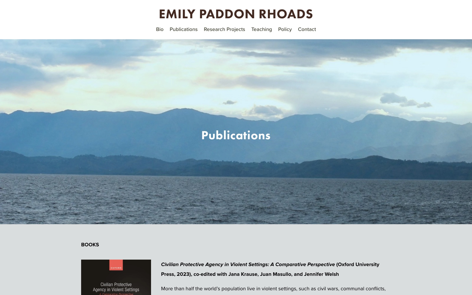
The publications page
Her books and articles were the thing visitors most often came looking for, so they got a page of their own with a clear heading and room for each entry to breathe.
Specific improvements
- Clarity: Publications and research projects split into their own sections, so each one has room instead of competing for space under a single heading.
- Navigation: A menu that grew with the work, so students and collaborators can reach a specific publication or project in a couple of clicks.
- Trust: A polished, professional design that keeps pace with her academic work as it accumulates.
- Mobile: A fully responsive layout that reads well on a phone, not just a desktop monitor.
The result
The site now gives students, collaborators, and journalists a clear, credible first impression — and makes it easy to find exactly what they came for, whether that's a recent publication or a way to get in touch.